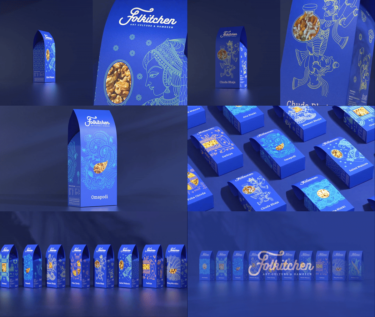
Folkitchen main page
Packaging Design & Strategy
FOLKITCHEN
Why is folk art stylisation used for the packaging?
India is known as the land that portrays cultural and traditional vibrancy through its conventional arts and crafts. This idea is to make people aware of it and further embrace it. The brand's strategy was encouraging appreciation through their range of products: 'Namkeens' (Indian savoury snacks), which could closely be related.
Wondering how was it related?
Just like the diversity in Indian savoury snacks, there is also a massive diversity in Indian folk art. By combining the unique folk art specific to each region, the design perfectly complements the regional Namkeen, creating a cohesive and authentic representation. For example, Warli Folk art and the Poha Chivda Namkeen are both from the region of Maharashtra.
Packaging strategy:
The illustration stylization is intentionally kept linear and simple, featuring a see-through packing style. The illustration and see-through cutout seamlessly blends, allowing the viewer to see the savory inside the box. The linear illustration style aids in immediately identifying the associated art style, encouraging individuals familiar with any of these art forms to share and discuss their experiences, further spreading awareness.
Front of the prototype
Back of the prototype
Folkitchen main page


